Convert Elementor tabs from Accordion to menu for mobile version or keep tabs in mobile

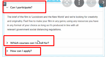
For those who work with the Elementor builder, you will know that the tabs element in the mobile version turns into an accordion (as in the image below).
When the tab has little content, mainly informative, this is convenient both aesthetically and functionally.
But when the content is too large in size, it means too much height, which means too much scrolling down to find the next tab. Many times this means that visitors get confused and don’t understand that it’s an accordion, leaving the page with a bad sense of functionality.
So how do we turn mobile accordion tabs into a normal menu, above the content?
Step 1:
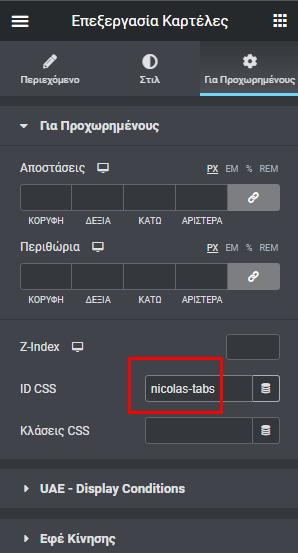
In the tabs element, we’ll go to the “Advanced” settings and add the id: nicolas-tabs to it
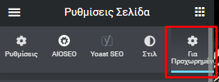
Immediately after, we will go to the page settings (bottom left)
And we’ll select the “Advanced” tab again
There we will add the following css code and press save:
@media only screen and (max-width: 600px) {
#nicolas-tabs .elementor-tabs-wrapper {
display: flex;
flex-direction: column;
}
#nicolas-tabs .elementor-tab-title{
height: 15px;
padding-top: 5px;
padding-bottom: 20px;
border:1px solid #CCC;
margin: auto;
width: 50%;
}
}
@media only screen and (max-width: 600px) {
#nicolas-tabs .elementor-tab-mobile-title {
display: none;
}
}
The code above makes the aforementioned conversion from an accordion to a vertical menu with borders, on devices with a max-width: 600px screen, i.e. mobile phones.
Now, if you want to keep the regular tabs, forget the code above and use the following:
@media (min-width: 320px) {
#nicolas-tabs .elementor-tabs-wrapper {
display: flex;
flex-direction: row;
}
}
@media (min-width: 320px) {
#nicolas-tabs .elementor-tab-mobile-title {
display: none;
}
}
Best regards, Nicolas – MaxServices.gr , NicolasLagios.com
This post is also available in:
Ελληνικά


